Understanding CSS Flexbox
Enkya
October 19, 2018
9 min read
 Photo by José Alejandro Cuffia on Unsplash
Flexbox is a box model specification defined by w3.org
Previously, the available layout models were; block, inline, table and positioned. These were mostly managed with the float property. If you have tried hacking your way through this approach of developing web layouts, you know how hard it is to get things looking right. Especially in this era of multiple device screen sizes. Achieving a responsive layout without breaking the layout is really a challenge.
Flexbox was developed as an improved approach to building web component layouts.
When applying layout to Markup, the most important thing is to have good context of what the markup looks like i.e. How elements are nested and how they are laid out relative to one another.
Flexbox is a one dimensional specification that allows us to choose between a row and a column as our main axis for the layout. The picture below describes the most recurring aspects of the flex specification.
 Photo by JavaScript Teacher via this Medium post
So if we have a div container with 4 items as shown below
The Basic properties
Note: some CSS is left out because it is only used for visual support in illustrating these aspects_._
<div class="container">
  <div class="red"></div>
  <div class="green"></div>
  <div class="purple"></div>
  <div class="blue"></div>
</div>
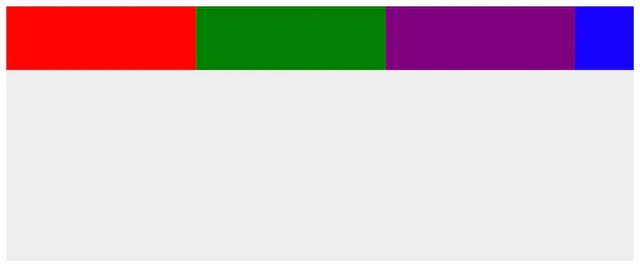
Because the default browser styling for div is block, elements appear as shown below.

First we start off by setting the display property of the container to flex. This quite literally implies that div is the container for the items that we shall be laying out.
.container {
  display: flex;
  height: 200px;
  width: 100%;
}
Then we can start looking at how to apply the properties of flex.
Flex-direction
This is the property responsible for the direction of the main axis.
It can be:
 |
|---|
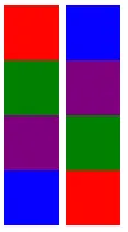
| column vs column-reverse |
row: left to right.
row-reverse: right to left
column: top to bottom
column-reverse: bottom to top
 |
|---|
| flex-direction: row-reverse |
 |
|---|
| flex-direction: row |
row-reverse and column-reverse completely invert the axis meaning the flex-end and flex-start shall be reversed too.
Note: display: flex; defaults to _flex-direction: row
_For the purpose of this article, the preferred flex-direction shall be row unless referenced otherwise
1. Justify-content:
We use justify-content to align items along the main axis.
The most commonly used property values are:
- Flex-start: the beginning of the main axis (the flex-start)
- Flex-end: aligns items to the end of the main axis (the flex-end)
- space-between: aligns items to fill up the whole container. The item’s outer boundaries are aligned with the boundary of the container. The total extra space is then evenly divided amongst the items as spacing.
- space-around: evenly spaces the items while including space around the outer boundaries of the outer most items in the container.
- center: aligns items to the center of the container.
Setting justify-content to flex-end:
.container {
  display: flex;
  flex-direction: row;
  justify-content: flex-end; // set to flex-end
}
The result is shown below.
 |
|---|
| flex-end |
Other alignment examples
 |
|---|
| space-around |
 |
|---|
| space-between |
2. align-items:
This property is used to place items along the cross-axis i.e. perpendicular to the main axis.
The values used by this property are familiar. These are; flex-start, flex-end, and center.
Alignment also has:
- stretch:
Here, the items are stretched out to fill the container height. This is only if the item has no cross-size property (e.g. height) and no margins have been set to auto. This is the default property value
 |
|---|
| stretch |
- baseline:
Items are aligned along their lowest points (baselines) such that the “longest” item’s highest point is in contact with the container’s upper boundary.
 |
|---|
| baseline |
If we set the align-items property to flex-start, we can override it on a particular child of the container with **align-self**
 |
|---|
| align-self is used to give container children different alignment |
Note: align-self is used to override the cross-axis alignment for items in the container. align-items applied to the item will not work!
Other examples
 |
|---|
| center |
3. flex-basis:
flex-basis is the property to determine the initial size of the item. flex-basis can be used therefore to determine the height and width of an item.
This property’s value can be any acceptable linear metric like px, rem or percentages.
It can also be:
- auto:
this sets the defined width value for the item sizing. If no width value is set, this will then default to content - content:
this indicates automatic sizing based on the item’s content.
Note: the initial size of the item is determined with flex-basis first and then other flex-properties are then applied
Let us apply a flex-basis of 20% to the items
.container {
  // ...
}

.item {
  align-self: flex-end;
  flex-basis: 20%;
}
We can see that the items stretch to fill up the space evenly according to those percentages
 |
|---|
| flex-basis: 20% |
If there are variations of flex-basis applied to items in the same flex container, their dimensions will be computed as ratios of the of total number of items.
 |
|---|
| The different flex-basis values above are computed as ratios of their total flex-basis |
Flex-basis is constrained can be constrained with upper and lower limits like min and max.
To be more exact, If we apply a flex-basis to all items and set for a particular item a min-width greater than its flex-basis, the item will respect will the min-width constraint.
 |
|---|
| items with flex-basis constraints |
4. flex-grow:
flex-grow allows us determine the rate at which the item will grow relative to all items in the container when positive space (extra space) is provided.
This property takes a numerical value and computes it as a ratio.
Setting flex-grow to 1 for the items will cause them to grow at an even rate to fill the extra space in the container.
Setting flex-grow of one item above others will cause it to grow at a faster rate in the ratio provided.
 |
|---|
| flex-grow: 3; // for the red item |
5. flex-shrink:
This property is used to determine the rate at which an item will shrink relative to all items in the container when negative space (less space) is provided.
 |
|---|
| flex-shrink: 3 for blue |
Note:
When shrinking, the flex-shrink factor is multiplied by the flex-base size ( a definitive value for the flex-basis e.g. 200px not 20%). This is to ensure that a larger item shrinks significantly before a smaller item shrinks to zero.
6. flex-wrap:
This property is used to define the container as either single-line or multi-line. When the total length of items along the main-axis exceeds the available container main axis space, items can be allowed to overflow onto another line in the container.
The default value is **nowrap** (single-line). Other property values include:
- wrap: multi-line.
This also defines the direction in which new lines are created as similar to the cross axis direction.
For example:
In row flex container, the wrap will introduce the new line of items top-down. This is because the cross axis direction is top(cross-start) to bottom(cross-end).
In a column flex container, the wrap will introduce new lines left to right. - wrap-reverse: multi-line.
The direction for the new lines is in the opposite direction of the cross axis flow. e.g. (right to left for a row, bottom-up for a column)
 |
|---|
| flex-wrap: wrap |
 |
|---|
| flex-wrap: wrap-reverse; |
7. align-content:
When we have multi-line containers, there arises a need to align the lines along the container’s cross axis just like we do with the align-items property.
This property allows us to do just that for the lines with the same property values as the align-items. These are: space-around, space-between, center, flex-end, flex-start, center, stretch.
 |
|---|
| align-content: flex-end |
 |
|---|
| align-content: center |
8. order:
Generally, items are presented in the same order in which they appear in the source document.
The order property allows us to change that. It takes an integer value.
The default order value is 0.
Setting the order value of an item to a negative value therefore brings it first. And setting the value to a number higher than 0 sends it further away from the main axis start point.
The items are arranged according to the values of their integers.
 |
|---|
| order: 0 (Default) |
Let us apply order to different items
The result;
 |
|---|
| with various orders |
Shortcuts
There are some shortcuts to save us some time in implementation.
a. Flex-flow
flex-flow: flex-direction flex-wrap;
Defaults to:
flex-flow: row wrap;
Usage examples:
flex-flow: column nowrap;
flex-flow: column-reverse wrap;
b. Flex
flex: flex-grow flex-shrink flex-basis;
Defaults to:
flex: auto;
Usage examples
flex: 1 1 auto;flex: auto;flex: none;
Sample Implementation
I looked on Dribble and found something to build entirely with flexbox
The pen implementation is linked in the caption below
https://codepen.io/aenkya/pen/WaEBWp
Resources to learn from
Some Interesting articles if you want to deepen your front end skills with — performance considerations:
Hey, I just spent 8mins of your time. If you have an extra minute to give me some feedback, I would appreciate it if you could fill out this form for me. 😃
https://goo.gl/forms/MSg0bHcVAlENBWvE2
On and Forward ❤️🚀